The Role of UX Design in Data Visualization

In the realm of web app data development, the intersection of User Experience (UX) design and data visualization is becoming increasingly crucial. As we navigate the complexities of big data, the need for intuitive and effective data dashboards has never been more apparent.
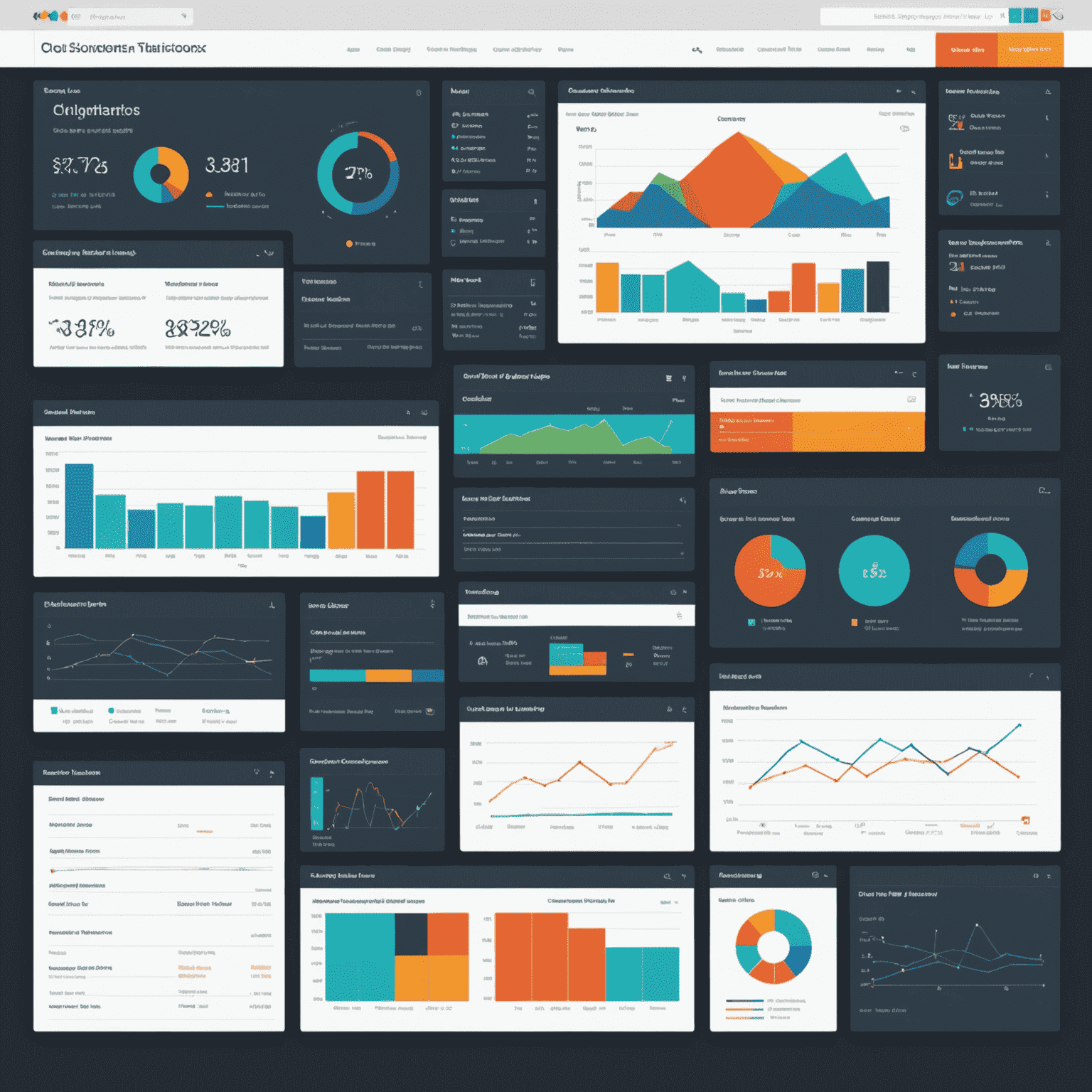
Why UX Matters in Data Visualization
When it comes to web data visualization development, the end goal is not just to present data, but to make it understandable and actionable. This is where UX design principles play a pivotal role:
- Clarity: A well-designed interface ensures that complex data sets are presented clearly, allowing users to grasp insights at a glance.
- Efficiency: Thoughtful UX design in data dashboards minimizes the cognitive load on users, enabling them to navigate through vast amounts of information efficiently.
- Engagement: Interactive elements and intuitive layouts encourage users to explore data more deeply, leading to better decision-making.
Key UX Principles for Data Visualization
At FirstLedger Web App Data Development Studio, we adhere to several core UX principles when designing data visualizations:
- Know Your Audience: Understanding the end-users' needs and technical expertise is crucial in creating effective visualizations.
- Simplify Complex Data: Use design techniques to break down complex information into digestible chunks.
- Choose the Right Visualization: Select chart types and graphs that best represent the data and align with users' mental models.
- Implement Consistent Design: Maintain visual consistency across all elements to reduce cognitive load and improve usability.
- Provide Context: Ensure that visualizations include necessary context to prevent misinterpretation of data.
The Impact of Good UX in Data Dashboards
Implementing strong UX design in data dashboard development can lead to significant benefits:
- Increased User Adoption: Intuitive designs encourage more frequent use of data tools within an organization.
- Faster Insights: Well-designed visualizations allow users to identify trends and patterns more quickly.
- Reduced Errors: Clear presentation of data minimizes the risk of misinterpretation and poor decision-making.
- Enhanced Collaboration: User-friendly interfaces facilitate better communication of data insights across teams.
Conclusion
As specialists in web app data development, we at FirstLedger understand that the marriage of UX design and data visualization is not just about making things look pretty—it's about creating functional, insightful, and impactful tools. By prioritizing user experience in our data visualization projects, we ensure that our clients can harness the full power of their data, driving informed decisions and fostering innovation in their respective fields.
In the ever-evolving landscape of web design development and data dashboard creation, the role of UX will only continue to grow. As we push the boundaries of what's possible in data visualization, we must always keep the end-user at the forefront of our design process.